

Totara Sponsorship at Learning Technologies
Totara is a global talent development platform that offers customers a highly flexible platform for their learning and development needs. Totara currently serve over 1,500 organisations worldwide and have more than 20 million users in 140 countries. In 2022 Totara was the main sponsor of one of the biggest events in the e-learning industry, Learning Technologies (LT). LT is Europe's leading showcase of organisational learning and the technology used to support learning at work. It attracts over 8,500 L&D professionals, 200+ exhibitors and continues to grow in importance and attendance year on year. This event took place at London ExCeL in May 2022.
Client
Totara
Service
Branding, Visual Design
Date
May 4, 2022
Challenge
The Learning Technologies 2021 event was cancelled due to the pandemic situation. But they were back in 2022 bigger and better, so it had to be the same with Totara's sponsorship presence. For the first time, Totara made a deal to brand one of the cafés at the venue and the other café was sponsored by Totara's competitor, Moddle. Totara wanted people to come to the café for good conversation, to meet new people or catch up with old friends and generally to have a really positive and memorable experience. Totara was also immersed in a rebranding process that wouldn't be finalised by the time the event was running. So we were facing a triple challenge; being able to provide brand recognition, a good experience as well as use this opportunity as a transition for the new branding that was coming.
Solution
Started with a series of sketches that help to organise and visualise the sections based on the moodboard we agreed on first. Then, I created the mockups of the whole view of the space with all the areas working together; the two seating areas, café unit and centre space with the screens. The seating area which needed to be a cosy and friendly space uses the warm colours from the sub-brand Totara Community, to create a social friendly community vibe to enjoy a coffee in the middle of the busy event; and life-size photographs of our Totara customers in the side walls were a powerful combination to attract people.
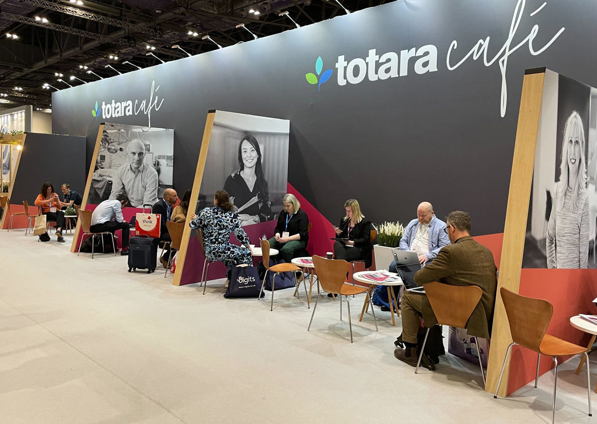
The charcoal colour tied together the different areas: the centre space where Totara included a three-wall panel with screens, the totara café unit and the seating area. This colour enabled a good connection between the cold palette from the main brand (blue, green and teal) and the warm palette (pink, orange, purple) and the perfect bridge for the new branding that the company released one year after.
This annual event project involved so many different aspects and required a good level of organisation across several design stages. From reviewing the proposals, and budgets from the builders with the team based on timelines and floorplan (which changed both and we had to make a few amendments to them) to selecting the carpet colour and number of chairs, tables and plants to complete and warm it up the space.